The team nodded. Nobody pushed back. The number went up.
Then it went up again the next sprint. And again. And again. By Q3 the team was "delivering" 150% of what they'd done six months earlier. Leadership was thrilled. The charts looked incredible.
The codebase was falling apart.
Not in a dramatic way. Not in a "production is on fire" way. In the slow, invisible way that doesn't show up until it's too late. Shortcuts compounding. Tests getting skipped. Architecture decisions made for speed instead of sustainability. Technical debt accumulating in places nobody was looking because everyone was looking at the velocity chart.
And the velocity chart looked amazing.
That manager was me.
I was the clueless leader. I was the one who looked at the chart and decided it should go up. I was the one who asked "why did velocity dip this sprint" in a tone that made it clear there was only one acceptable answer. I set the expectation. My team responded rationally. And by the time I realized what was happening, the damage was already compounding.
Everything I'm about to describe in this post, I learned by doing it wrong first.
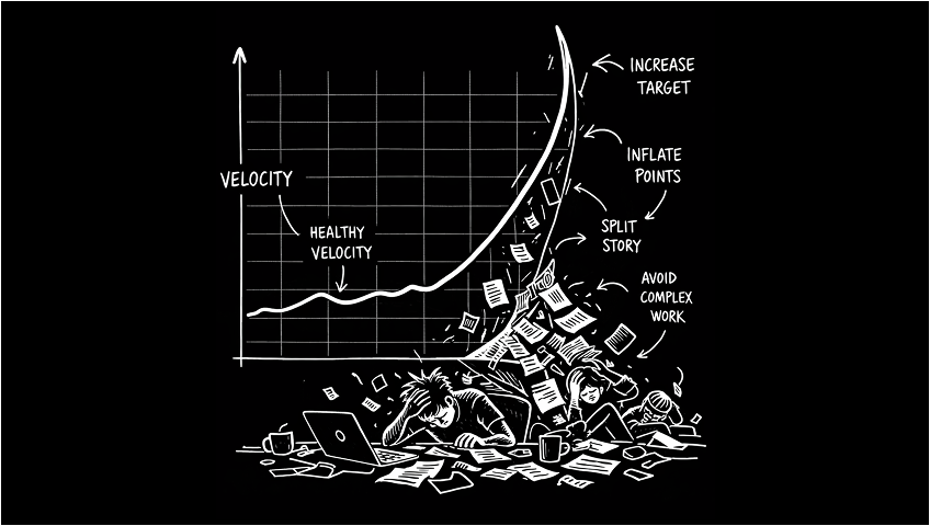
How the Hockey Stick Forms
It always starts the same way. Someone in leadership reads a headline. AI makes developers 3x faster. Or they see another team's velocity and want to know why yours is lower. Or they just look at the chart and think "this should go up because up is good."
So they set a target. Not explicitly. Nobody sends an email saying "your velocity needs to increase by 20%." They just start asking questions. "Why did velocity dip this sprint?" "What's blocking us from doing more?" "Other teams are accelerating, what's different about ours?"
Engineers are pattern matchers. They hear those questions and they understand the game immediately. The number needs to go up. So they make the number go up.
Point Inflation
This is the first thing that happens and it's the most invisible.
A story that was a 3 last quarter becomes a 5 this quarter. Not because the work got harder. Because the team learned that bigger numbers make the chart look better. Nobody calls it inflation. They call it "better estimation" or "accounting for complexity we used to undercount."
I've seen teams double their velocity in two quarters without changing their actual output by a single feature. The work was identical. The numbers were bigger. Leadership saw acceleration. The team saw survival.
The insidious part is that it's nearly impossible to detect from the outside. Velocity is relative to the team's own scale. There's no universal standard. A 5-point story on my team might be a 13-point story on yours. So when the numbers go up, there's no external benchmark to say "wait, you're just counting differently."
Let me be clear about what I'm not saying. I'm not saying teams shouldn't break work into shallow vertical slices. They should. That's how championship-level teams ship together. Small, reviewable, independently valuable pieces of work. I'm not saying teams shouldn't update their estimates as they learn more about a problem. They should. Estimation improves with context, and a story that looked like a 3 in planning might genuinely be a 5 once you understand the edge cases.
What I'm saying is there's a difference between refining how you work and performing for a dashboard. One is engineering maturity. The other is corporate theater. And you can tell the difference by asking one question. Did the way we estimate change because we learned something, or because someone needed the number to go up?
Complexity Avoidance
This is the one that actually damages the product.
When velocity is a growth metric, engineers optimize for closeable tickets. That means they start avoiding the work that's hard to estimate, hard to scope, and hard to close cleanly in a single sprint.
Refactoring a critical service that three teams depend on? That's a multi-sprint effort with uncertain scope. It might not close cleanly. It might blow up the velocity chart. Better to pick up four small features instead.
Investigating a performance issue that's been slowly degrading the checkout experience? That's open-ended. Could take two days. Could take two weeks. The chart doesn't reward investigation. It rewards closure.
Building the tooling that would make the whole team faster for the next six months? That's infrastructure work that doesn't have a ticket anyone's tracking and doesn't produce a feature anyone can demo.
All of that work gets deprioritized. Not because the team doesn't know it matters. Because the measurement system punishes them for doing it.
The Backlog Becomes a Stage
Once the team learns that velocity needs to grow, the backlog transforms. It stops being a prioritized list of valuable work and starts being a curated collection of closeable tickets.
Stories get written to be completable, not valuable. Acceptance criteria get scoped to what can ship in a sprint, not what would actually solve the problem. Work gets split into tickets that satisfy the board instead of tickets that make sense as engineering deliverables.
None of this is malicious. All of it is rational. The system rewards throughput, so the team optimizes for throughput. Throughput and value have almost no correlation. Nobody wants to surface that because surfacing it means questioning the metric leadership is using to evaluate the team.
The Math Nobody Questions
The behaviors are bad enough on their own. But the real problem is the trajectory.
If velocity needs to increase every sprint, where does it end?
90 points becomes 120. 120 becomes 150. 150 becomes 180. Run that trajectory out for a year and you'd need 500 points a sprint to stay on track. Two years and it's 1,000.
Nobody does this math because the expectation is never stated that explicitly. It's always "we should be able to do a little more." Just a little. Just 10%. Just "what we did last sprint plus one more story."
But compounding growth expectations applied to a fixed team size have only one possible outcome. Either the team inflates the numbers, or the team burns out. Usually both. First the inflation, to buy time. Then the burnout, when the gap between the real work and the reported work becomes too exhausting to maintain.
I've watched this destroy teams that were genuinely high performing. Not because they couldn't deliver. Because the delivery was never enough. The target kept moving. The team kept chasing it. And eventually the people who couldn't stomach the charade left. Which meant the remaining team had even less capacity. Which meant the velocity pressure increased. Which meant more inflation, more shortcuts, more burnout.
It's a death spiral that starts with a chart that only goes up.
What Healthy Velocity Actually Looks Like
Here's the thing nobody wants to hear. A healthy velocity chart is flat.
Not flat because the team is coasting. Flat because the team has found its sustainable pace and is delivering consistently against it. The line isn't going up. It isn't going down. It's hovering in a range, sprint after sprint, with small natural variations.
That flat line means the team knows what it can do. Planning is accurate. Commitments are reliable. The work that gets planned actually gets shipped. There are no heroics. There are no death marches. There are no sprints where the team over-delivers by 200% followed by sprints where they crash and deliver 50%.
Stability is the signal. Not growth.
The best engineering organizations I've worked in never once celebrated a velocity increase. They celebrated something much harder to achieve. Stable delivery with fewer surprises. Quarter after quarter of hitting commitments. Shipping what they said they would ship, when they said they would ship it.
That's boring. It doesn't make a good slide. Nobody gets promoted for presenting a flat chart. But it's the foundation that everything else depends on. Reliable estimates. Trustworthy timelines. Leadership that can make commitments to the business because they know the team will deliver.
A hockey stick velocity chart means one of two things. Either the team genuinely found a way to do dramatically more work in less time (which happens, but rarely, and usually plateaus quickly). Or the team learned to game the numbers. And in my experience, it's the second one about 90% of the time.
The AI Wrinkle
This is getting worse right now because of AI.
Every engineering leader has read the same headlines. AI makes developers 3x more productive. Copilot reduces task completion time by 55%. Teams using AI ship features 40% faster. Those headlines become expectations. "We adopted AI tools three months ago. Why isn't velocity up 3x?"
AI productivity gains are real. But they don't show up in velocity. They show up in stability. Fewer bugs. Fewer incidents. More predictable delivery. The kind of improvement that makes "our velocity stayed the same but we had 30% fewer production incidents" the honest story. But that story doesn't make the quarterly deck. "Our velocity increased 50% since adopting AI" does.
So the pressure to show velocity growth gets amplified by AI adoption. Leadership expects the hockey stick because the headlines promised it. The team produces the hockey stick because that's what survival requires. And the actual gains get buried under inflated numbers that tell a better story.
The teams I've seen use AI most effectively are the ones where velocity stayed flat and everything around it got better. That's the win nobody's celebrating because it doesn't look like acceleration.
What to Measure Instead
I wrote about this in detail in my last post on Jira. The short version is outcomes, commitments, stability, and learning. Not points. Not tickets closed. Whether the team delivered what it promised, whether the product got better, and whether the team learned something that compounds.
If you're putting a velocity chart in a leadership deck, replace it with one question. Did the team do what it said it would do? That answer tells leadership everything velocity never could.
The Conversation You Need to Have
If your velocity chart looks like a hockey stick, you have a conversation ahead of you. And it's uncomfortable.
You need to tell leadership that the number they've been watching doesn't mean what they think it means. That the growth they're seeing isn't the team getting faster. It's the team getting better at producing the number leadership wants to see.
That's a hard conversation. Because it means admitting that the reporting has been misleading. Not intentionally. Not maliciously. But structurally. The system incentivized a behavior, and the behavior produced a metric, and the metric told a story that wasn't true.
Most engineering leaders avoid this conversation. Because the alternative is easier. Keep the chart going up. Keep leadership happy. Deal with the consequences later.
But later always arrives. It arrives as attrition when your best engineers get tired of the performance. It arrives as quality issues when the shortcuts compound into production incidents. It arrives as missed commitments when the gap between the reported velocity and the real capacity becomes too wide to hide.
The teams that survive this have a leader willing to say "velocity should stabilize, and here's what we should be measuring instead."
The teams that don't have a beautiful chart and a quiet crisis.
If your team's velocity only goes up, something else is quietly going down.
Start asking what that something is before the chart tells you.